5 Graphic Design Elements that Make a PowerPoint Presentation Look Professional
I have created quite a few PowerPoint presentations lately and I feel like it became a preferred tool for clients who want the flexibility to tweak the text how ever they like after the design is done. PowerPoint presentations are pretty cool from a client perspective but quite limiting from a design perspective.
However, designers, found a way to work with a tool that doesn’t offer the flexibility of Indesign, Illustrator, and Photoshop but it can attain pretty neat results when used in combination with good design skills and Adobe Creative Cloud.
Here are five design elements that every presentation should have or not have.
Branding
I think it goes without saying how important it is to brand your presentation. Start by changing the colour scheme to the colours of your brand. Fonts should be changed as well. The pain is that PowerPoint for Mac doesn’t embed the fonts when saved, but PowerPoint for Windows does. In case you are using Mac, there is a paid program that embeds the fonts for you, but if you are not willing to pay for the little program, then I recommend using fonts existent in PowerPoint.
Less text, more visuals
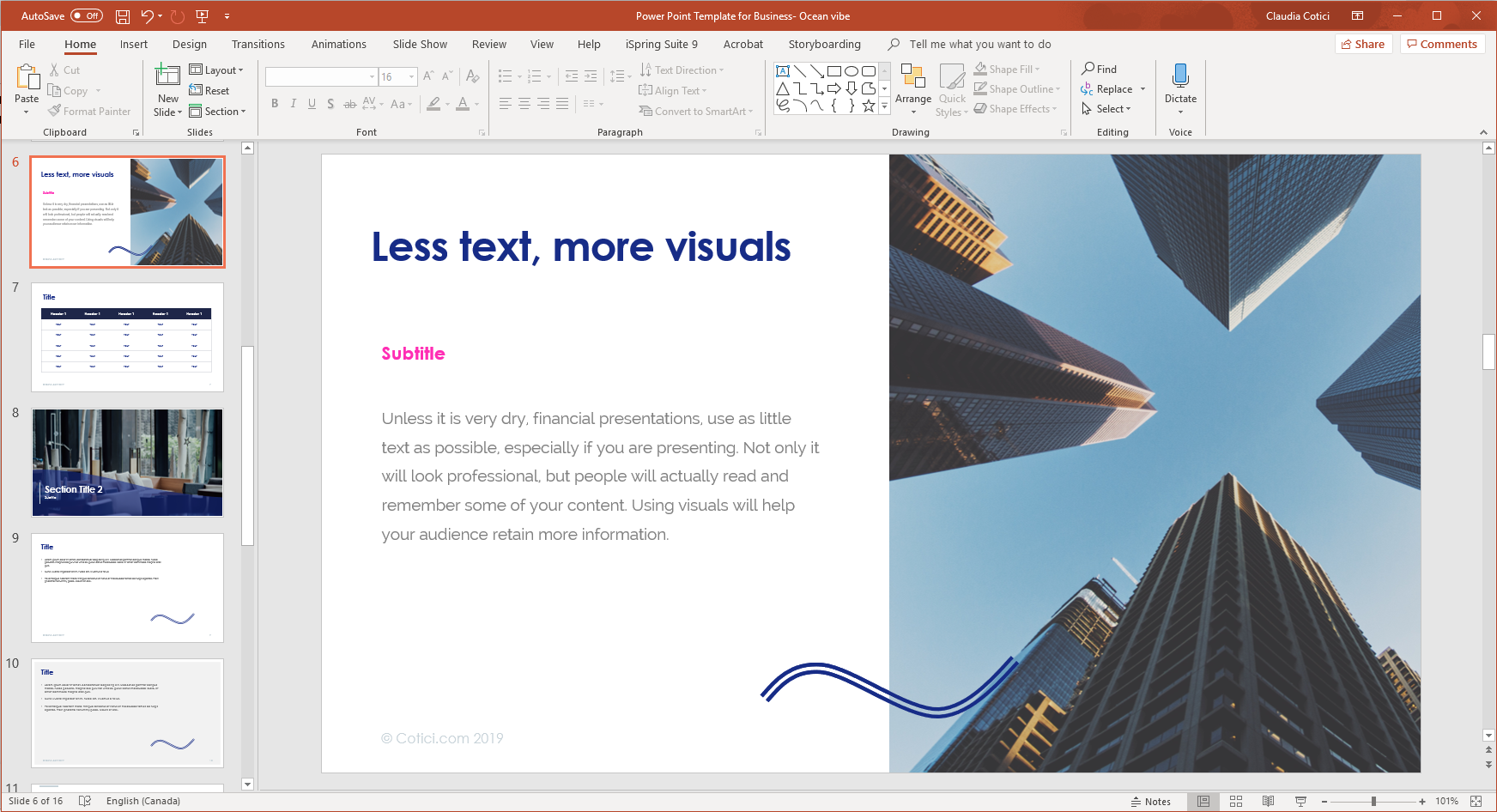
Unless it is very dry, financial presentations use as little text as possible, especially if you are presenting. Not only it will look professional, but people will actually read and remember some of your content. Using icons, illustrations, photography and data visualization will make your presentation look very professional.
Footer
Depending on the purpose of your presentation, the footer can contain the name of the presentation, website and page number.
The page number is a must! The copyright symbol is also important if the information is supposed to stay behind the doors.
No, you don’t have to add your logo on every page in the footer. The footer is meant to add information that doesn’t distract from the content and chances are that your logo will stand out more than necessary. Plus, it looks a little bit desperate.
Your logo should definitely be on your presentation, but not added on every single slide! It is not necessary. People usually remember the first and the last thing, so add it on the first and the last slide.
Consistent text styles
Microsoft Office has this wonderful feature of Paragraph Styles, but unfortunately Power Point doesn’t. One trick is to change the Master page styles and hope it will apply in the over all presentation. It doesn’t work all the time, but you can easily create Master templates and use those for consistency.
Master Layouts

There’s a thing behind the scenes called Master Slide and what this does is setting up the main layout for the whole presentation. In a Master Slide your set up the header and the footer, which stays consistent in the whole presentation. Here, you can change the title style, the body styles, and the colour scheme. You can also add the footer and the header.
A good presentation aims for goals and it is a combination of informative copy and great visuals.